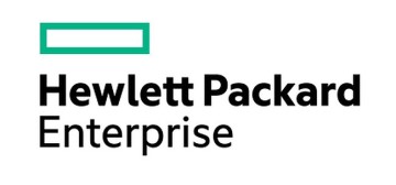
 The maker of expensive printer ink HP, which is hiving itself off into two businesses has issued the logo of its new HP Enterprise logo and it is… well… pretty square.
Somewhere at the design stage, HP decided that it did not need a real logo and just stuck a hollow rectangle on a piece of paper. To make it even less interesting they coloured it using the same teal crayon which was always left in the bottom of the box at playcentre – being too blue for grass and too green for sky. Pretty much says HP to us.
To be fair to HP, the rectangle is one of the more understated geometric shapes and more recently has been the centre of a trademark dispute between Apple and Samsung. HP has avoided this problem by giving its rectangle four sharp corners, something Jonathon Ive never thought of.
HP CEO Meg Whitman said that Hewlett Packard Enterprise would carry a rich legacy, but she did not mention Kirk and Spock or McCoy – which is something that we would have thought was a nobrainer. However we also did not think that a rectangle said computer company either.
Whitman said: ”We wanted to build on the past and create a brand that supports the business we are today and projects who we will be in the future. But first, we had to ask ourselves, what do we want to stand for in the marketplace? What do we want to be known for? What are the values that drive us?”
A rectangle. Nope, can’t really see it.
“To bring our ideals to life, we needed a logo and a design system that would be singular and defining. We needed a design that would express our renewed commitment to focus and simplicity. And we needed a logo that would be as transformative, flexible and agile as we are becoming, while standing out from the pack. Finally, the logo needed to work across all the ways we would use it,”
Yep a Rectangle is pretty versatile – not sure that you can transform it into something like a triangle. If you wanted something really versatile you should have a single dot in the centre of a page. Geometrically it can be anything and no-one can say that HP is pointless ever again.
However we personally think that HP would have been better off with a circle rather than a rectangle, as it is something which shows HP’s sense of direction over the last few years.
